
Wednesday 8 December 2010
Bits n bobs
When creating my billboard Advertisement i found a sketch that i did in my first year of college, which is of a fashion model wearing a dress with a design on it that i drew from my inspiration of lowry's cubism techniques. This gave me an idea of Advertising an online store for products such as clothes, music, food and other luxuries.
 I have found out that keeping all of my old work does come in handy when proffessionalising yourself, also these small sketches help me find out how much my perception on influencial drawing has changed due to university.
Thursday 2 December 2010
Promotional pages
As of today i don't care what anyone in my class has to say about my work due to stupid comments about my background on my portfolio pages and not my rebranding i feel that the lesson today was a waste of time for feedback on my promotional work and now i don't know how i can make this better.
Well ill try again, heres my work tell me what you think about my Promotional work NOT MY BACKGROUND!!
Billboard Design


Well ill try again, heres my work tell me what you think about my Promotional work NOT MY BACKGROUND!!
Billboard Design

Letterhead and Web Banner

Business card and Gift bag

Tuesday 30 November 2010
rebranding my promotional items
Last night i got into creating my advertising for my brand JSTR which is aimed at the higher class working people who like to spend their money on luxury goods such as expensive clothing, gifts, music and lots more. Heres some of the work i have done up to now please feel free to leave any comments.
 On this image i was trying to create a keyboard style outline for my text, this was acheived easily by simply using a inner shadow on the keys, by doing this it gives the keys depth and the illusion that the keys are 3d.
 This will appear at the bottom of the billboard advertisement which will be showing what our online networking site can offer such as, downloadable music, clothing and jewelry. all of these will have images in a slideshow on the front of my billboard.

This is my Gift bag which i have shaped like this for more of a unique style, little things that are styled like this give out waves of attention, this can attract more consumer attention to my online services if i put a web address on.

This is my web Banner, i thought seen as though its coming christmas i may as well involve some sort of deal in my banner to advertise money off.
By tomorrow i will have my letterhead, gift bag, Billboard and Business card all presented on here then i will think of a layout for my promotional work.


This is my web Banner, i thought seen as though its coming christmas i may as well involve some sort of deal in my banner to advertise money off.
By tomorrow i will have my letterhead, gift bag, Billboard and Business card all presented on here then i will think of a layout for my promotional work.
Monday 29 November 2010
spreadsheets


Both spreadsheets finisished and layed out nicely, also advert for Harry Halls Garage completed.

Saturday 27 November 2010
Flick Account ACTIVATED!!
Heres my Flickr account guys add me as a contact n lets get rockin. http://www.flickr.com/people/urban_illustration/
Enjoy the Networking!!!!
Enjoy the Networking!!!!
Tuesday 23 November 2010
Just a few layout ideas (Not finished)
When i gained my feedback from the group i was taunted to try to be more creative and play around with my layout to create more of an attractive layout, when planning my layout i wanted a slanted text box but level with my image, also i wanted my image to be broke into sections which are seperated slightly but still able to show an image. Here's a page from my Nortern quarter spreadsheet.
 The text is well spaced and easily readable, also the font for the Heading really works well with the subject of the area im talking about.
Here's the other side of the spreadsheet which is not yet completed but will have a photo of the Sacha's Hotel. I may play about with the photo to create a more interesting photo, maybe even take the photo just before the sun goes down so i can acheive a warmish glow to create the feel of comfort.
 I didn't want to input alot of info on this page, i just wanted the relevant info about what the hotel has to offer and where to find certain areas for tourist attractionist's. After thinking that this spreadsheet will be going onto the internet i will be drawing my own button's which will be links to online profile making websites such as, facebook, myspace, twitter ........
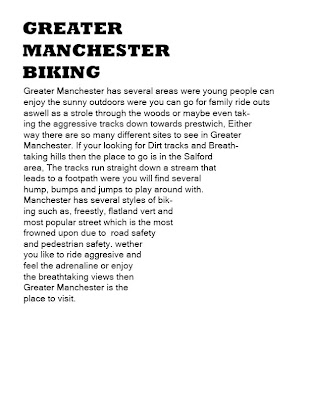
Biking Round Manchester
When creating my biking spreadsheet i was inticed by how much history Manchester has for its Cycling culture, i found out that Manchester was home to some of the best Cyclists in the world who participated in several challenging races.
 As you can see i have still yet to find images around the Manchester area were i can capture images relating to biking. i would like to find patches of mud with bike tracks and dirt hills but they are a fair distance away so i would have to plan ahead to acheive these images.
 This is the spreadsheet about Harry hall's bike shop which will be my advert for biking round Manchester, i chose this shop because it had the most cultural meaning behind it and also this shop has alot of history behind it and to this day it still flourishes with good deals and quality customer service.

Here's the other side of the spreadsheet which is not yet completed but will have a photo of the Sacha's Hotel. I may play about with the photo to create a more interesting photo, maybe even take the photo just before the sun goes down so i can acheive a warmish glow to create the feel of comfort.

Biking Round Manchester
When creating my biking spreadsheet i was inticed by how much history Manchester has for its Cycling culture, i found out that Manchester was home to some of the best Cyclists in the world who participated in several challenging races.


Friday 19 November 2010
Fonts for my spreadsheets
Northern quarter
. For this layout i want a victorian style font that can reflect on the times when the industrial revolution was in full swing, this would give the reader an idea on what the article will be about so this technique can also be a way of attracting readers attention.
Greater Manchester & Harry halls
. For this article i want a dirty, rough style font that can relate to the agggresion and messyness in riding around the dirt paths and ramps around the Greater Manchester area.
Subscribe to:
Posts (Atom)